Leonardo da Vinci is one of the few undisputed geniuses mankind has produced. A polymathic innovator, he was the ultimate Renaissance man – making key advancements in science, engineering, architecture and biology, as well as creating artwork which has captivated and enthralled for the centuries since his death in 1519.
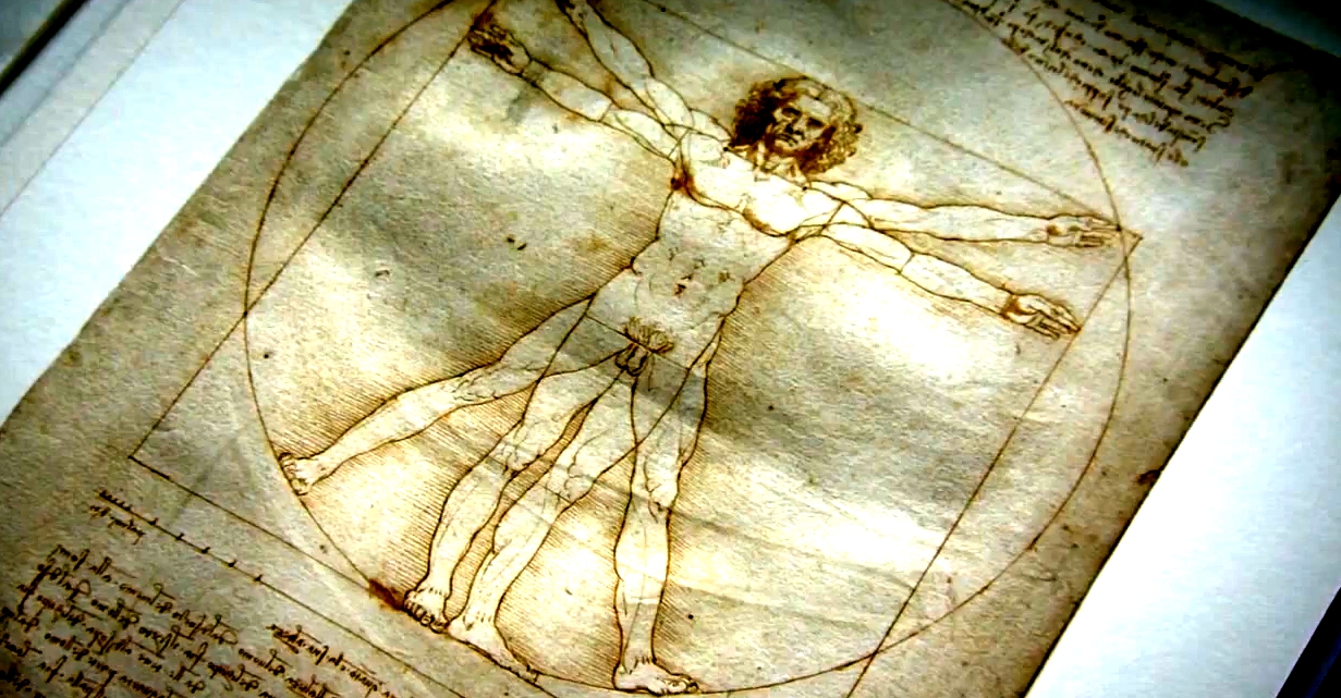
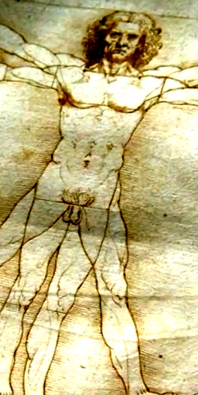
One of his most iconic illustrations is known as Vitruvian Man. Study of this beautiful diagram of the perfectly proportioned man reveals the many hidden geometrical and mathematical truths which Leonardo had studied intently in his work. Art is a science, he said. where form, function and beauty are locked together.
Named in honour of the Roman architect Viruvias, the diagram explores the Vitruvian idea that the human figure should be the principal source of proportion in Classical architecture.
In quantifying the proportions he chose whole number ratios which he believed were geomtrically and asthetically harmonious. Vitruvius determined that the ideal body should be eight heads high, for example.
Despite the symmetry Vitruvias extolled, there is an asymetrical aspect to Leonardo’s illustration. The centre of the square is positioned slightly down from the centre of the circle. Here, in this short entertaining and excellently made BBC documenatary, Marcus du Sautoy explains why this kind of detail reveals hidden meaning in da Vinci’s work.
Vitruvian Man | The Beauty of Diagrams
